A landing page has one job: turn visitors into leads. For many service-based companies, that means generating more phone calls, contact form submissions, appointment requests, and bookings. Yet many small business websites still send paid traffic and high-intent visitors to pages that are too broad, too cluttered, or too confusing to convert well.
Effective small business landing page optimization is not about adding flashy design elements or making a page look trendy. It is about creating a focused experience that matches what the visitor wants, builds trust quickly, and makes the next step feel easy.
Whether someone finds your business through Google Ads, local search, email marketing, or social media, the landing page they reach should guide them toward action without distraction. A high converting landing page usually feels simple to the user, but that simplicity is the result of careful strategy.
Below are the core elements a landing page for lead generation should include if your goal is to increase inquiries and bookings across a service business website.
Start With One Clear Goal
The biggest problem with many landing pages is that they try to do too much at once. A visitor lands on the page and sees multiple offers, too many links, competing calls to action, and large sections of information that do not help them decide what to do next.
Before writing or designing anything, define the page’s primary conversion goal. For example:
- Call your business
- Submit a quote request form
- Book an appointment
- Schedule a consultation
- Request an estimate
That one goal should shape the page layout, copy, form fields, buttons, and supporting content. If the page tries to push several actions equally, conversion rates often suffer because visitors are forced to make too many decisions.
Strong service business landing page tips almost always begin with clarity. One page. One audience. One main offer. One next step.
Write a Headline That Matches Search Intent
Your headline is often the first thing visitors read. It should immediately confirm that they are in the right place.
A weak headline is vague, clever, or focused only on the company. A stronger headline speaks directly to the service the visitor is looking for and the result they want.
For example, a service-based business might use headlines such as:
- Get a Professional Website Designed to Generate More Leads
- Reliable WordPress Support for Growing Businesses
- Book Expert Google Ads Management for Better Lead Quality
The best headlines are specific, relevant, and easy to understand in seconds. If a visitor has to interpret what you mean, you are already creating friction.
Supporting text under the headline should reinforce the value proposition. Explain what you offer, who it is for, and why someone should take action now instead of continuing to search.
Use a Strong Above-the-Fold Section
The section visible before scrolling matters because it shapes the user’s first impression. This area should quickly answer the most important questions:
- What service is being offered?
- Who is it for?
- Why should the visitor trust this business?
- What should the visitor do next?
A high-performing above-the-fold section often includes:
- A clear headline
- A short supporting paragraph
- A strong call-to-action button
- A phone number if calls are a priority
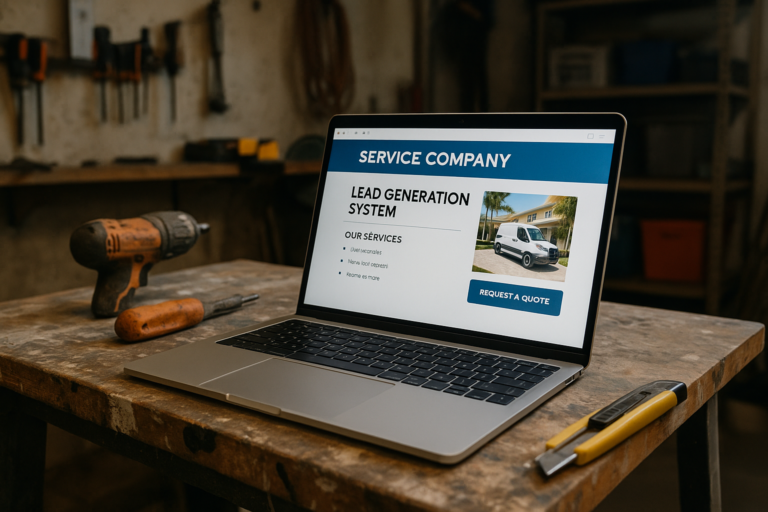
- A relevant image, mockup, or visual proof element
- Trust indicators such as years of experience, industries served, or platform expertise
For service businesses, this section should not be overloaded with long paragraphs. Visitors need a quick path to understanding and action.
Make the Call to Action Impossible to Miss
If you want more calls, form submissions, or bookings, your call to action must be visible, specific, and repeated naturally throughout the page.
Weak buttons like Submit or Learn More rarely convert as well as clearer action-driven phrases. Stronger examples include:

- Request a Quote
- Schedule a Consultation
- Book Your Appointment
- Get Website Support
- Talk to an Expert
Your CTA should also match the visitor’s readiness level. Someone searching for immediate help may respond well to a direct action like calling now. Someone researching a larger service may prefer completing a short form or booking a consultation.
Strategically place CTAs:
- Near the top of the page
- After major benefit sections
- After trust-building sections
- Near the bottom of the page
Consistency matters. The page should guide visitors toward one primary action rather than switching between multiple competing asks.
Keep Navigation Limited to Reduce Distraction
One of the most effective techniques in small business landing page optimization is reducing unnecessary exits. Unlike a general website page, a landing page is not meant to encourage broad exploration.
If the page includes a full website menu, multiple sidebar links, and many footer options, some visitors will click away before converting. In many cases, a simplified header or limited navigation helps keep attention on the offer.
This does not mean visitors should feel trapped. It means the page should prioritize conversion over browsing.
Focus on Benefits, Not Just Features
Many small business landing pages describe services without explaining why they matter. Features are important, but benefits are what persuade.
For example:
- Feature: Mobile-responsive website design
- Benefit: Your site looks professional and works smoothly for customers searching on their phones
- Feature: Ongoing WordPress maintenance
- Benefit: Your website stays secure, updated, and less likely to break when your business depends on it
- Feature: Google Ads management
- Benefit: You can attract more qualified leads instead of paying for low-value clicks
Visitors are thinking about outcomes: saving time, reducing stress, increasing leads, improving trust, or getting faster help. Your copy should connect the service to those real business goals.
Build Trust Early and Repeatedly
Trust is a major conversion factor, especially for service businesses where the visitor may be sharing contact information, requesting a quote, or committing to a consultation.
Your landing page should reduce uncertainty by showing that the business is experienced, credible, and reliable. Useful trust elements may include:
- Years in business
- Industries served
- Platform or service expertise
- Client testimonials
- Before-and-after examples or portfolio samples
- Clear contact information
- Professional branding and design consistency
For example, a business with more than 20 years of experience can use that as a strong trust signal when relevant. A company that offers long-term support, website maintenance, and ongoing technical help can also position continuity as a differentiator. These details matter because they reassure visitors that they are dealing with professionals who can support them beyond the initial sale.
Trust is not built with one badge or one claim. It is built by how the entire page feels: clear, credible, polished, and consistent.
Use Forms That Feel Easy to Complete
Forms are essential on many lead generation pages, but they are also a common source of friction. If your form is too long, too intrusive, or confusing, visitors may abandon it.
Ask only for the information you truly need to start the conversation. In many cases, a lead form can work well with:
- Name
- Phone number
- Brief message or project details
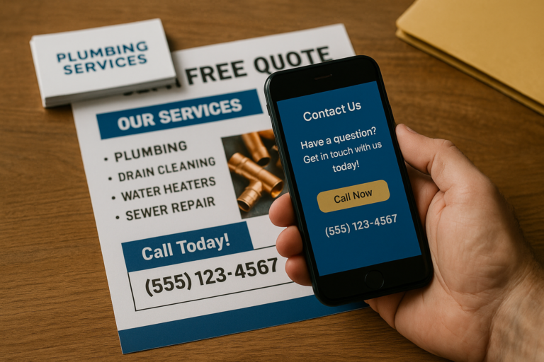
If your business depends heavily on calls or bookings, add click-to-call functionality and an easy scheduling option where appropriate. Some users would rather call than type. Others prefer forms because they are busy or contacting you outside normal business hours. A good landing page supports both preferences when it makes sense.
Keep labels clear, error messages simple, and mobile usability strong. If a form is frustrating on a phone, conversion rates can drop quickly.
Design for Mobile First
A large share of small business traffic comes from mobile devices. That makes mobile usability a core part of every landing page for lead generation, not an afterthought.
A mobile-friendly landing page should have:
- Readable text without zooming
- Buttons large enough to tap comfortably
- Fast loading speed
- Short sections with clear spacing
- Sticky call or booking buttons when appropriate
- Forms that are easy to complete on smaller screens
If your landing page looks great on desktop but feels awkward on mobile, you may lose a large percentage of ready-to-convert visitors.
Improve Speed and Technical Performance
Page speed influences user experience, trust, and conversion potential. Visitors expect pages to load quickly. If the page is slow, many will leave before reading your offer.
Common landing page speed problems include:
- Oversized images
- Too many scripts or plugins
- Bloated page builders or unnecessary animations
- Poor hosting performance
- Unoptimized mobile assets
For small businesses, strong technical performance is more than a developer concern. It directly affects lead generation. A faster page creates a better first impression and supports better conversion results from SEO, Google Ads, and other traffic sources.
Show Social Proof in the Right Places
Social proof helps visitors feel more confident that others have trusted your business and had a positive experience. Instead of isolating all social proof in one area, place it where it helps overcome natural hesitation.
Examples include:
- A testimonial near the form
- A review snippet near the headline
- Industry-specific credibility points near service benefits
- A brief case example after explaining your process
Keep testimonials believable and readable. Specific feedback usually performs better than generic praise. Realistic comments about responsiveness, professionalism, communication, and results often matter more than exaggerated claims.
Explain the Process to Reduce Uncertainty
People are more likely to contact a business when they understand what happens next. If the process feels unclear, visitors may delay action.
A simple step-by-step section can increase conversions by making the next stage feel manageable. For example:
- Contact us with your needs
- We review your goals and recommend the best approach
- We schedule the service, consultation, or project kickoff

This kind of section works especially well for professional services, web development, digital marketing, maintenance plans, and booking-based businesses. Clarity reduces hesitation.
Use Comparison Messaging to Clarify Why the Page Converts
Sometimes it helps to show the difference between a generic page and a focused landing page. This makes the value of optimization easier to understand.
| Generic Website Page | High Converting Landing Page |
|---|---|
| Multiple goals and mixed messaging | One clear goal and focused offer |
| Full navigation with many exit points | Limited distractions and stronger CTA focus |
| General business information | Specific benefits tailored to visitor intent |
| Long, unfocused content blocks | Scannable sections built for decision-making |
| Weak or generic form submissions | Simple, optimized forms and stronger prompts |
| Little emphasis on urgency or trust | Strategic trust signals and next-step clarity |
This comparison highlights why dedicated landing pages often outperform standard service pages, especially when connected to paid advertising or campaigns with clear conversion goals.
Match the Page to the Traffic Source
A landing page performs better when it aligns closely with the source sending visitors to it. Someone clicking a Google Ads campaign for website maintenance should not land on a broad homepage covering every service equally.
Message match matters. The headline, supporting copy, CTA, and service focus should reflect the original ad, keyword, email, or campaign message that brought the visitor there.
This alignment helps improve both user confidence and conversion rate. It also creates a smoother experience from first click to final action.
Measure What Happens After the Click
No landing page should be considered finished once it goes live. Real performance comes from tracking and improvement.
At minimum, a small business should measure:
- Phone call clicks
- Form submissions
- Appointment bookings
- CTA button clicks
- Bounce rate and engagement patterns
Tracking helps identify where visitors lose interest or where the page succeeds. Sometimes a headline change, form simplification, layout update, or mobile improvement can make a meaningful difference.
Landing page optimization is ongoing. The best pages evolve based on user behavior, campaign goals, and business priorities.
Support Conversion With Strong Visual Structure
Good visual structure makes content easier to scan and understand. This is especially important for busy business owners and service shoppers who are comparing multiple providers quickly.
Strong structure includes:
- Clear headings and subheadings
- Short paragraphs
- Bullet points for benefits and features
- Consistent spacing
- Readable contrast and typography
- Visual hierarchy that emphasizes the CTA
Design should support action, not compete with it. A polished page feels professional and easier to trust.
Do Not Ignore the Thank-You Experience
Conversion does not end when someone submits a form or books an appointment. The next step should confirm that the action worked and set expectations clearly.
A good thank-you page or message can:
- Confirm receipt of the request
- Explain when the visitor should expect a response
- Offer a direct phone number for urgent needs
- Reinforce professionalism and reliability
This follow-up experience helps maintain trust and reduces the chance that leads feel uncertain after contacting you.
Why Landing Page Quality Matters for Small Businesses
For many small businesses, every lead matters. Wasted traffic is expensive, whether it comes from advertising, SEO, referrals, or email campaigns. A strong landing page helps make better use of the attention your business has already earned.
It can also improve results without increasing traffic. In many cases, converting more of the visitors you already have is more cost-effective than constantly trying to buy more clicks.
This is why small business landing page optimization should be treated as an important business asset, not just a design task. The right page can support growth by turning online interest into measurable action.
Conclusion
A small business landing page that generates more calls, form submissions, and bookings is not built around guesswork. It is built around clarity, trust, usability, and a strong conversion path.
The most effective pages focus on one goal, speak directly to the visitor’s intent, present benefits clearly, remove distractions, and make action simple on both desktop and mobile. They also support trust with credible messaging, useful social proof, and a polished user experience.
If your current page gets traffic but not enough leads, the problem may not be your service. It may be the page experience itself. Improving a high converting landing page often means refining what visitors see, what they feel, and how easily they can take the next step.
For service businesses across the United States, better landing pages can lead to better conversations, stronger lead quality, and more consistent growth.