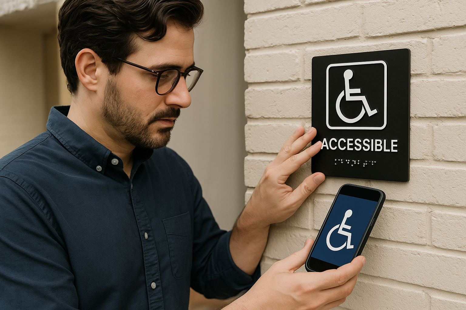
Website accessibility is no longer something small businesses can afford to treat as optional. A website should be usable by as many people as possible, including visitors with visual, hearing, motor, and cognitive disabilities. When accessibility is overlooked, businesses risk frustrating potential customers, weakening trust, and creating avoidable compliance concerns.
The good news is that improving website accessibility for small businesses does not always require a complete redesign. In many cases, practical updates can make a meaningful difference quickly. Clearer navigation, better color contrast, descriptive links, keyboard-friendly forms, and properly structured content all help create a better experience for every visitor, not only people with disabilities.
For small business owners across the United States, accessibility should be viewed as both a usability priority and a long-term website quality standard. A more accessible website can support stronger customer trust, better engagement, improved mobile usability, and a more professional online presence. It can also help businesses move closer to the expectations commonly associated with an ADA website accessibility checklist and broader small business website compliance best practices.
Why Website Accessibility Matters for Small Businesses
Accessibility is often misunderstood as a highly technical issue that only affects large corporations. In reality, it matters to businesses of every size. Small businesses depend heavily on their websites to create first impressions, answer questions, generate leads, and convert visitors into customers. If users cannot comfortably browse the site, read its content, or complete basic actions, opportunities are lost.
Accessibility improvements help in several important ways:
- Better user experience: Simple, readable, well-organized pages are easier for everyone to use.
- Higher trust: An inclusive website signals professionalism, care, and attention to detail.
- Broader audience reach: More people can access your content, products, and services.
- Stronger mobile usability: Many accessibility improvements also help smartphone and tablet users.
- Reduced compliance risk: Accessibility efforts can help businesses align more closely with accepted standards and expectations.
Accessibility is not just about legal exposure. It is about making sure your website works for real people in real situations. Someone may be using a screen reader. Someone else may have low vision and need higher contrast. Another user may not be able to use a mouse and must navigate by keyboard. Others may be in a noisy environment and rely on captions, or they may have cognitive challenges that make cluttered layouts difficult to follow.
When a website is built with these realities in mind, it generally becomes better for everyone.
Accessibility, ADA Expectations, and Small Business Website Compliance
Many business owners search for an ADA website accessibility checklist because they want to understand what practical steps they should take. While website accessibility compliance can involve legal and technical nuances, the most widely recognized benchmark is the Web Content Accessibility Guidelines, often called WCAG. These guidelines focus on making content perceivable, operable, understandable, and robust.
For small businesses, the goal should not be to chase perfection through guesswork. The smarter approach is to identify common barriers and remove them systematically. That creates measurable progress toward an accessible WordPress website or accessible website on any platform.
Accessibility work is best seen as an ongoing process, not a one-time task. Websites change. New pages get added. Plugins are updated. Images are replaced. Forms evolve. That means accessibility should be reviewed regularly as part of normal website maintenance.
Practical Accessibility Fixes That Deliver Immediate Value
1. Improve Color Contrast
Low contrast is one of the most common accessibility problems on small business websites. Light gray text on a white background may look modern, but it can be hard to read for many users, especially those with low vision or those viewing the site on mobile devices in bright conditions.

Practical fix:
- Use dark text on light backgrounds or light text on dark backgrounds with clear contrast.
- Avoid placing text over busy images unless readability is carefully protected.
- Check buttons, links, headings, and form labels for visibility.
This change improves readability immediately and often strengthens visual clarity across the entire site.
2. Use Clear Heading Structure
Headings are not just visual design elements. They help organize content for users and assistive technologies. A properly structured page should move logically from section to section, making it easier to scan and understand.
Practical fix:
- Use one clear page topic and logical H2 and H3 subheadings.
- Avoid skipping heading levels randomly.
- Make headings descriptive rather than vague.
A well-structured page is easier to navigate for screen reader users and also improves readability for busy visitors who scan before they commit to reading.
3. Add Meaningful Alt Text to Images
Alternative text, or alt text, gives screen readers a way to describe images. Without it, visually impaired users may miss useful context, service information, or calls to action.
Practical fix:
- Write short, accurate descriptions for images that convey important meaning.
- Do not stuff alt text with keywords.
- Leave decorative images empty when they provide no informational value.
For example, a service page image might use alt text like Technician repairing commercial HVAC unit rather than a generic phrase such as image123.
4. Make Links Descriptive
Generic link phrases like click here or read more are not very helpful when read out of context by assistive technology. Descriptive links tell users where they are going before they activate the link.
Practical fix:
- Use anchor text such as View our website maintenance services or Download the service overview.
- Avoid using raw URLs as visible link text unless necessary.
- Make sure linked buttons and text clearly communicate purpose.
This helps accessibility, improves content clarity, and often benefits SEO by making internal links more informative.
5. Ensure Keyboard Navigation Works Properly
Some users rely on a keyboard rather than a mouse. If menus, forms, popups, or buttons cannot be used with the Tab key and Enter key, the website may be difficult or impossible for them to navigate.
Practical fix:
- Test your site by navigating without a mouse.
- Make sure menus, links, buttons, and form fields receive visible focus.
- Ensure popups and dropdowns can be opened and closed by keyboard.
Keyboard usability is one of the clearest indicators of an accessible WordPress website or accessible site on any platform.
6. Fix Forms That Are Hard to Complete
Forms are often where conversions happen, and they are also a common source of accessibility failures. Missing labels, unclear instructions, poor error messages, and tiny clickable areas can stop users from contacting you or requesting service.
Practical fix:
- Use visible labels for every field.
- Provide clear instructions before the user submits the form.
- Show helpful error messages that explain exactly what needs to be corrected.
- Make form fields large enough to use easily on mobile devices.
Accessible forms improve lead generation because they reduce friction for everyone, not just users with disabilities.
7. Add Captions and Transcripts for Media
Video and audio content should not depend entirely on sound. Captions help users who are deaf or hard of hearing, and transcripts can provide another way to access the information.
Practical fix:
- Add captions to marketing videos, tutorials, and service explainers.
- Provide transcripts when audio contains meaningful information.
- Avoid auto-playing media that surprises users.
This also helps visitors who are browsing in quiet offices, public spaces, or environments where audio is inconvenient.
8. Avoid Relying Only on Color to Communicate Meaning
If a form error is shown only in red, or a chart relies only on color differences, some users may miss the meaning entirely.
Practical fix:
- Pair color with text, icons, or patterns.
- Label required fields clearly rather than only highlighting them with color.
- Use symbols or written messages for warnings and status changes.
This makes content clearer and more reliable across a wider range of users and devices.
9. Improve Text Readability
Accessibility is not only about code. Content readability matters too. Dense paragraphs, tiny text, poor spacing, and complicated wording can create barriers.
Practical fix:
- Use readable font sizes.
- Keep paragraphs reasonably short.
- Use plain, direct language when possible.
- Break content into sections with clear headings and lists.
Readable content supports better comprehension, lower bounce rates, and a more trustworthy brand impression.
10. Review Popups, Sliders, and Dynamic Elements
Many modern websites include promotional banners, sliders, sticky headers, chat widgets, and popups. These features can interfere with accessibility if they trap keyboard focus, hide content, or create motion-related distractions.
Practical fix:
- Use popups sparingly.
- Make sure dismiss buttons are accessible.
- Avoid excessive motion or provide controls to pause movement.
- Check whether key content becomes blocked on smaller screens.
Less clutter usually creates a better experience overall.
What an ADA Website Accessibility Checklist Should Include
Business owners often want a simple way to think about accessibility priorities. While formal testing can go much deeper, a practical small business checklist usually includes the following:
- Text has sufficient color contrast
- Pages use logical heading structure
- Images include meaningful alt text where needed
- Links and buttons are clearly labeled
- Menus and forms work with keyboard navigation
- Forms include labels and helpful error messaging
- Videos include captions when appropriate
- Content does not rely only on color to communicate meaning
- Text is readable on desktop and mobile devices
- Popups, sliders, and widgets do not block accessibility
- Site structure remains consistent from page to page
- Important pages are tested regularly after updates
This kind of ADA website accessibility checklist gives small businesses a strong starting point for meaningful improvement.
Why Accessibility Matters Even More on WordPress
WordPress powers a large share of business websites because it is flexible, scalable, and manageable. But flexibility also introduces risk. Themes, page builders, plugins, forms, and third-party tools can all affect accessibility in different ways.
Creating an accessible WordPress website requires attention to both content and technical setup. A well-designed page can still create problems if a plugin adds inaccessible navigation, a popup tool traps focus, or a form builder lacks proper field labeling.
Common WordPress-specific areas to review include:
- Theme quality: Some themes are built with cleaner accessibility support than others.
- Page builder output: Visual builders can speed up design, but they should still produce usable headings, buttons, and layouts.
- Plugin choices: Contact forms, sliders, event tools, and ecommerce plugins can introduce barriers.
- Media handling: Uploaded images should include alt text and embedded videos should support captions.
- Ongoing updates: Changes to WordPress core, plugins, or layouts can affect accessibility over time.
For that reason, accessibility should be part of long-term website maintenance, not just launch-day planning.
Accessibility Improvements Also Support SEO and Conversions
Accessibility and SEO are not identical, but they often overlap in useful ways. Search engines value websites that are organized, readable, mobile-friendly, and easy to understand. Users do too.
When accessibility improvements are made thoughtfully, they often contribute to:
- Better page structure
- Stronger internal linking clarity
- Improved image context
- Lower friction on forms
- Better mobile usability
- More consistent engagement signals
That matters because most small businesses do not need more website traffic alone. They need better outcomes from the traffic they already have. If visitors can quickly understand your services, navigate your site, and contact you without frustration, conversion performance often improves.
How Small Businesses Should Approach Accessibility Going Forward
The most effective approach is practical and ongoing. Start with the most important customer-facing pages, such as your homepage, service pages, contact page, booking pages, and lead forms. Then review the elements that most often create accessibility barriers.
It also helps to think in terms of risk reduction and quality improvement rather than perfection. Small businesses rarely need to solve every possible issue overnight. They do need to make steady improvements, document their efforts, and treat accessibility as part of normal website standards.
A useful process often looks like this:
- Audit the most important pages and user actions.
- Fix the highest-impact usability barriers first.
- Review WordPress theme, plugin, and form behavior.
- Test on mobile devices and with keyboard-only navigation.
- Recheck accessibility after updates and redesigns.
- Build accessibility into future content publishing.
That process supports stronger small business website compliance efforts while also improving overall site quality.
Conclusion
Website accessibility is one of the most practical improvements a small business can make to its online presence. It helps more people use your site, strengthens trust, reduces friction, and supports a more professional digital experience. It also plays an important role in modern small business website compliance and can help businesses align more closely with accepted accessibility expectations.
The strongest accessibility improvements are often straightforward: clearer contrast, better headings, more descriptive links, usable forms, keyboard-friendly navigation, and readable content. These fixes do more than address technical concerns. They help your website function better as a business tool.
For small businesses across the United States, accessibility is not just about meeting expectations. It is about building a website that works for real users, supports long-term growth, and reflects the quality of the business behind it.