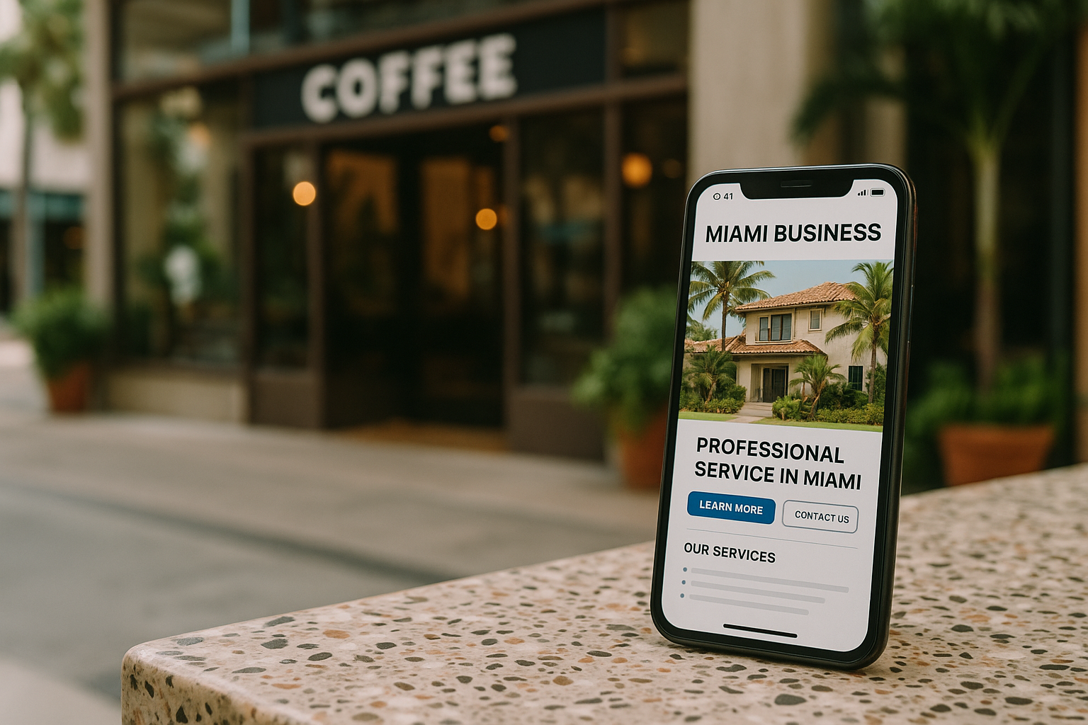
For many Miami small businesses, getting website traffic is only part of the challenge. The more important question is what happens after someone lands on the site. If visitors leave without calling, booking, requesting a quote, or making a purchase, then more advertising will not solve the deeper issue. Before raising a marketing budget, it often makes more sense to improve how the website converts the traffic it already receives.
Conversion optimization is the process of making a website easier to use, easier to trust, and easier to act on. For a local business, that may mean helping a visitor quickly understand what the company offers, why it is a good fit, and what to do next. Small improvements in clarity, speed, navigation, and messaging can often increase leads without more ad spend.
This matters even more in a competitive market like Miami, where people compare businesses quickly and often browse on mobile devices while on the go. A website that loads fast, answers questions clearly, and removes friction can outperform a site that simply attracts more clicks. Below are practical Miami website conversion tips that can help small businesses generate more value from existing traffic.
Why conversion rate matters more than raw traffic
Website traffic can look encouraging in reports, but traffic alone does not grow a business. A conversion rate measures the percentage of visitors who take a meaningful action, such as submitting a form, calling, scheduling an appointment, or completing a sale. When that percentage improves, the same number of visitors can produce more revenue opportunities.
For example, if a service business receives 1,000 visitors a month and 2% of them contact the company, that creates 20 leads. If the website is improved and the conversion rate rises to 4%, the same traffic now creates 40 leads. No additional ad spend is required. This is why conversion optimization for small business websites is often one of the most efficient ways to improve marketing results.
It also helps businesses make smarter use of future advertising. Sending paid traffic to a weak website wastes budget. Sending traffic to a high-converting site creates better return from every click.
Start with the visitor’s first impression
The first few seconds on a website matter. Visitors decide quickly whether they are in the right place. If the homepage or landing page is confusing, too generic, or visually cluttered, people may leave before they ever learn what the business offers.
Clarify the main value proposition
A strong headline should clearly explain what the business does and who it serves. Avoid vague lines that sound polished but say very little. A visitor should not have to guess whether the company offers the service they need.
Good website messaging often includes:
- A clear headline that names the service or solution
- A short supporting statement explaining the benefit
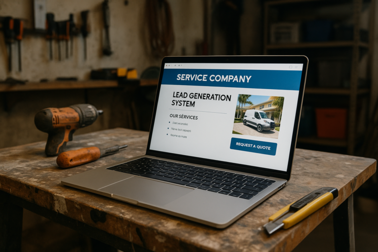
- A visible call to action, such as requesting a quote or booking a consultation
- Trust signals that reduce hesitation
For local businesses, location relevance also helps. Mentioning Miami or the service area naturally on key pages can reassure visitors that they have found a nearby provider.
Make the next step obvious
Every important page should guide users toward one primary action. If a page asks people to call, email, follow social media, read more, join a newsletter, and browse multiple unrelated services all at once, decision fatigue can lower conversions.
Choose the action that matters most for that page and make it prominent. This could be a quote request form, a phone number, a booking button, or an add-to-cart button. The goal is not to remove all options, but to reduce distraction around the main decision.
Improve mobile usability for Miami customers on the move
Many local searches happen on phones. People may be comparing businesses during lunch, while commuting, or while standing in a store or job site. If the mobile experience is frustrating, slow, or hard to read, those visitors are unlikely to convert.
Focus on mobile-first design choices
To improve website conversion rates for a Miami small business, mobile usability should be a priority. Important design choices include:
- Large, readable text without forcing users to zoom
- Buttons that are easy to tap
- Short forms that are simple to complete on a phone
- Sticky call or contact buttons where appropriate
- Fast-loading images and streamlined page elements
Think about what a mobile visitor needs most. If someone wants directions, hours, pricing guidance, service details, or a fast way to call, that information should be easy to find.
Reduce unnecessary friction
Small obstacles can quietly reduce leads. A form with too many required fields, a phone number hidden in the footer, or a booking link that opens awkwardly on mobile can all create drop-off. A good test is to try using the website with one hand on a phone and complete the desired action as if you were a busy customer. Any step that feels slow or unclear is a conversion problem.
Speed up the website to reduce abandonment
Page speed is both a user experience issue and a conversion issue. Visitors expect websites to load quickly. If a page takes too long, many users leave before engaging with the content.
Small business websites often slow down because of oversized images, too many plugins, unnecessary scripts, or unoptimized themes. Even a visually attractive site can underperform if it feels sluggish.
Common ways to improve speed
- Compress and properly size images
- Use modern file formats when possible
- Minimize unnecessary animations and heavy scripts
- Keep plugins lean and updated
- Use reliable hosting and caching tools
- Limit bloated design elements above the fold
Faster websites usually feel more trustworthy and easier to use. They also support better performance on mobile networks, which is especially relevant for local users searching from different neighborhoods across Miami.
Build trust before asking for action
People convert when they feel confident. A business website should answer the unspoken question every visitor has: why should I trust this company enough to contact them or buy from them?
Use trust signals in the right places
Trust signals do not need to be flashy. They simply need to help a potential customer feel informed and safe moving forward. Useful trust-building elements include:
- Clear business name and contact information
- Professional design and consistent branding
- Real team, office, or project photos where appropriate
- Testimonials or review highlights, if available and accurate
- Service area details
- Transparent descriptions of the process
- Policies, guarantees, or terms only when real and verifiable
Even basics like fixing broken links, updating outdated content, and removing old promotions can affect trust. Visitors notice signs that a site has been neglected.
Show that you understand customer needs
Trust also grows when website copy reflects real customer concerns. Instead of focusing only on what the business wants to say about itself, address the questions visitors are likely asking. What problem do they need solved? How does the process work? How long does it take to get started? What should they expect next?
This kind of clarity supports website leads without more ad spend because it helps visitors move forward with less hesitation.
Strengthen calls to action on key pages
A weak call to action can limit conversions even when traffic quality is good. If the site does not clearly invite people to take the next step, many will postpone the decision and leave.
Write calls to action that match user intent
Different pages support different stages of decision-making. Someone on the homepage may want a broad next step such as learning more or requesting a quote. Someone on a service page may be ready to schedule. Someone on an e-commerce product page may be ready to buy now.
Effective calls to action are specific and relevant. Examples include:
- Request a Quote
- Schedule a Consultation
- Call Now
- Check Availability
- Get Started
Generic buttons like Submit or Click Here tend to be less compelling because they do not reinforce the benefit of taking action.
Improve placement and repetition
A strong call to action should appear where users are most likely to need it, not only at the bottom of a page. Many high-converting pages place calls to action near the top, in the middle after important information, and again at the end. This helps visitors act when they feel ready instead of forcing them to search.
Make forms easier to complete
Forms are one of the most common conversion points on small business websites, and also one of the most common failure points. If the form is too long, confusing, or intrusive, visitors may abandon it even if they are interested.
Ask only for essential information
Every field adds friction. For many lead generation forms, the essentials are name, contact method, and a brief message or project detail. Additional questions should be included only if they are truly necessary for follow-up.
If the form is for a local service company, consider whether all fields are required. A shorter form often produces more inquiries, especially on mobile devices.
Reduce uncertainty around submission
People feel more comfortable filling out a form when they know what happens next. A short note near the form can help set expectations, such as explaining that someone will respond soon or that the information is used only for follow-up. Confirmation pages and confirmation messages also matter because they reassure the user that the action worked.
Improve service pages instead of relying only on the homepage
Many businesses focus heavily on the homepage, but visitors often land directly on internal pages from search results, map listings, referrals, or ads. If service pages are thin, outdated, or unclear, those visitors may never reach the homepage at all.
What a high-converting service page should include
- A clear description of the service
- The types of customers or problems it addresses
- Main benefits and outcomes
- Local relevance where appropriate
- Trust-building details
- A visible call to action
For example, a Miami service business may benefit from referencing the local area naturally when relevant, such as service coverage, scheduling availability, or practical needs specific to the region. The goal is not keyword stuffing, but context that helps local visitors feel the page is meant for them.
Use clearer navigation and page structure
Confusing navigation can hurt conversions because visitors cannot find what they need quickly. A website should make the path to information feel intuitive.
Simplify top-level navigation
Keep the main menu focused on the pages people actually use to make decisions. Too many top-level items can create clutter. For many small business websites, a simple structure works best: home, services, about, portfolio or projects if relevant, blog if active, and contact.
Use headings and scannable formatting
Most visitors do not read every word. They scan for relevance. Clear headings, short paragraphs, bullet points, and consistent spacing make pages easier to understand. Better readability can directly support conversion optimization for small business websites because users can find answers faster and feel less overwhelmed.
Align the website with search intent
Not every visitor arrives with the same goal. Some want to compare options. Others are looking for details about a specific service. Others are ready to contact a business immediately. A page converts better when it matches the intent that brought the visitor there.
If someone searches for a specific service in Miami, the landing page should focus tightly on that service rather than sending them to a generic homepage. If someone clicks a local listing expecting contact details or business hours, those details should be easy to access. Matching intent reduces friction and helps visitors move forward naturally.
Measure what users are actually doing
Conversion improvements are easier when decisions are based on real behavior. Instead of guessing why leads are low, small businesses should review basic performance data and observe where visitors drop off.
Useful metrics to watch
- Conversion rate by page
- Form completion rate
- Click-through rate on calls to action
- Bounce rate on key landing pages
- Time on page
- Mobile versus desktop performance
These metrics do not tell the whole story by themselves, but they can reveal where the biggest opportunities exist. For example, if a service page gets traffic but very few calls or form submissions, the issue may be messaging, trust, layout, or call-to-action placement. If mobile traffic is high but mobile conversions are low, usability may be the problem.
Test changes gradually
It is usually better to improve a few important elements at a time than to redesign everything at once. That makes it easier to see what actually helped. Start with high-impact pages such as the homepage, top service pages, and core landing pages. Adjust headlines, form length, button placement, page speed, and trust elements based on observed behavior.
Common mistakes that lower conversions
Many websites lose leads for reasons that are easy to miss internally because the business already understands its own services. A new visitor does not. Common conversion problems include:
- Unclear headlines that do not explain the offer
- Too many calls to action competing for attention
- Slow page speed, especially on mobile
- Outdated design or inconsistent branding
- Hard-to-find contact information
- Overly long forms
- Thin service pages with little detail
- Weak trust signals
- Poor navigation and cluttered layouts
Fixing these issues can have a meaningful effect on lead generation without requiring more traffic.
Why local context matters in Miami
Miami is a diverse, fast-moving market with strong competition across many industries. Customers often compare several businesses quickly before making contact. This means local companies benefit from websites that communicate clearly, load fast, and feel current.
Local context can improve conversions when used naturally. This may include highlighting service areas, making mobile contact easy, showing clear availability or process details, and ensuring pages are useful to people who want answers quickly. Businesses that remove friction often have an advantage over competitors whose websites feel confusing or outdated.
Conclusion
If a Miami small business wants more leads, sales, or inquiries, increasing ad spend should not be the first move. A better approach is often to improve the website’s ability to convert the traffic it already has. Stronger messaging, faster performance, mobile-friendly design, better service pages, simpler forms, and clearer calls to action can all help turn more visitors into customers.
The key idea is simple: conversion optimization is not about tricks. It is about making the website more useful, more trustworthy, and easier to act on. When a site clearly explains what the business offers and removes obstacles from the customer journey, it can generate better results without requiring a larger advertising budget. For small businesses in Miami, that can mean more efficient marketing, stronger lead generation, and a website that works harder with the traffic already coming in.